Utterspace is a small startup in stealth mode that needed branding work, a wireframe, and user flow to introduce the brand concept. Without saying too much, the product combines real estate, investing, and bidding – with a dash of technology.
Branding | UI Design | UX Design
BRAND DESIGN
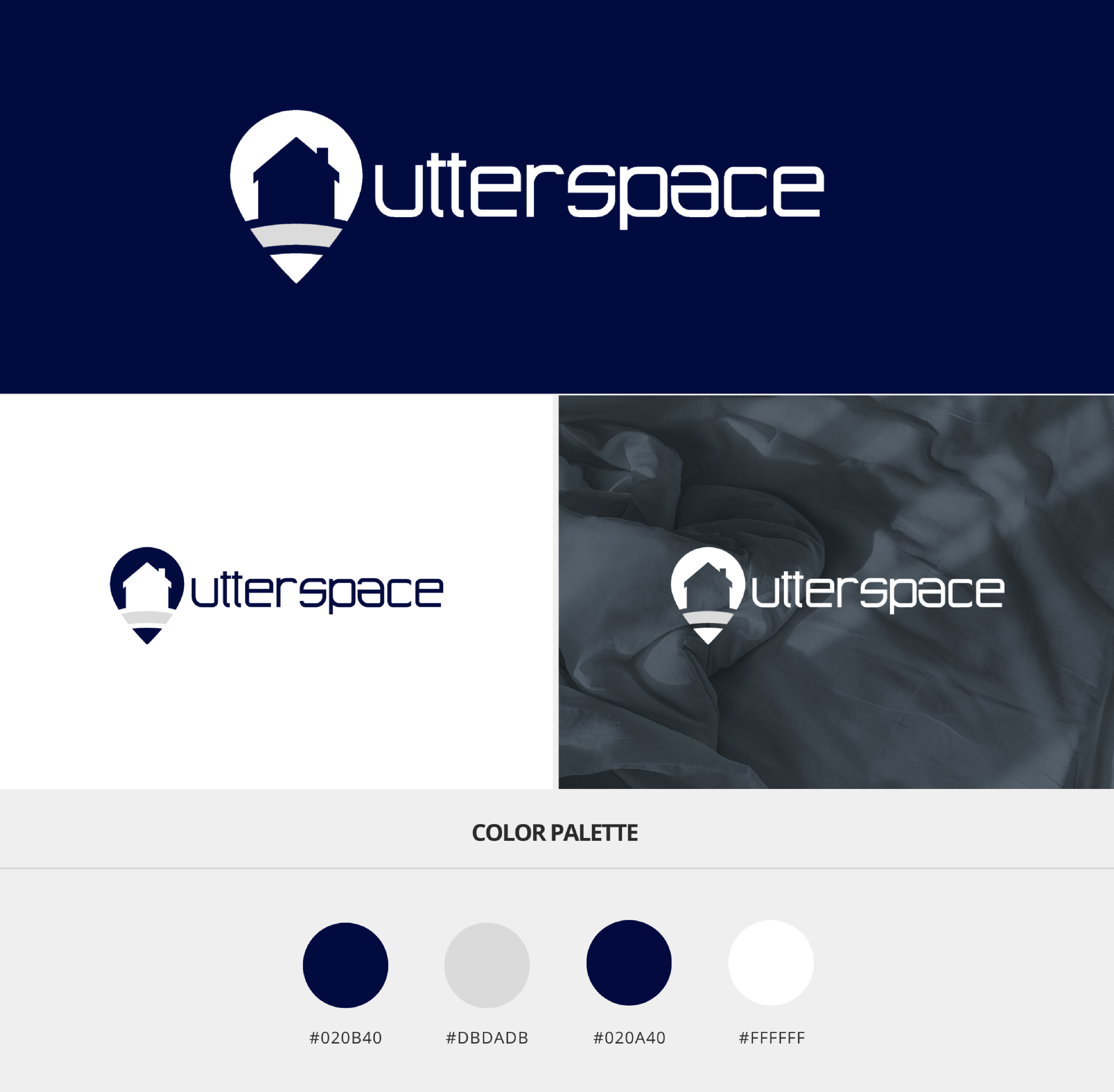
The Utterspace logo is a visual embodiment of the brand’s innovative approach to the intersection of real estate, investing, and technology. The design hinges on the simplicity of a house silhouette within a pinpoint location marker, symbolizing the company’s focus on precise and strategic real estate placements. The logo’s color scheme, featuring a deep blue, conveys trust, stability, and professionalism—essential qualities in the sectors of real estate and investment.
The use of negative space to create the house’s outline within the marker cleverly combines two central concepts—property and location—into one seamless icon, reflecting the brand’s integrated solution. The typeface is modern and clean, suggesting a forward-thinking and efficient approach, aligning with the startup’s technological edge.
In essence, the logo conveys Utterspace’s identity: straightforward, focused, and at the nexus of traditional real estate values and cutting-edge technology. It’s designed to be immediately recognizable and resonant with a tech-savvy audience while maintaining the approachability necessary for a broader market.
UI & UX DESIGN
The UX/UI design for Utterspace was constructed on the principle of seamlessly integrating the intricate elements of real estate, investing, and bidding into an intuitive digital interface. The intention was to forge a design that felt instinctive for a diverse range of users, from homeowners to investors and contractors.
Central to Utterspace’s design philosophy was the notion of clarity. Given the complex nature of the product, the interface needed to distill complexity into simplicity. This was realized through a minimalist design, utilizing generous whitespace to alleviate cognitive overload and crafting clear, directed pathways for navigating the processes of posting listings, making investments, offering contracting services, and locating homes.
The use of color coding and visual indicators was pivotal, creating distinct pathways for different users while preserving a unified brand aesthetic. Interactive features such as bid sliders, investment toggles, and a flowchart-based home search were integrated to foster user interaction.
In terms of UI, the typography was chosen for its legibility and professionalism, matching a layout that balanced informative content with engaging features. The wireframes were designed to be scalable, ensuring that as Utterspace expanded, the design could evolve without sacrificing its foundational simplicity and practicality.
The user flow was optimized for efficiency and straightforward interaction, reducing the steps required to complete tasks and ensuring clear transactions. By focusing on a user-centered design approach, Utterspace aimed to render the sophisticated ecosystem of real estate, investing, and technology accessible and uncomplicated for all its users.