Rugid Grind Coffee, an emerging coffee roasting venture currently in stealth mode, required branding and a website to debut its mission and serve as an online marketplace for its products. This company is dedicated to making a difference, with a core mission focused on supporting at-risk youth.
Branding | UI/UX Design | Web Development Videography & Editing
COMMERCIAL
This video showcases Rugid Grind, a Houston-based coffee roaster on a mission to combat teenage homelessness in the U.S. Born from a blend of coffee passion and social change during the 2010s, Rugid Grind has carved out a niche by ethically sourcing organic beans from rural farms, delighting customers with quality coffee. Beyond just brewing exceptional cups, the brand is a beacon of hope, proving how businesses can make a real difference. Rugid Grind represents the fusion of quality coffee with meaningful social advocacy, brewing change one cup at a time.
BRAND DESIGN
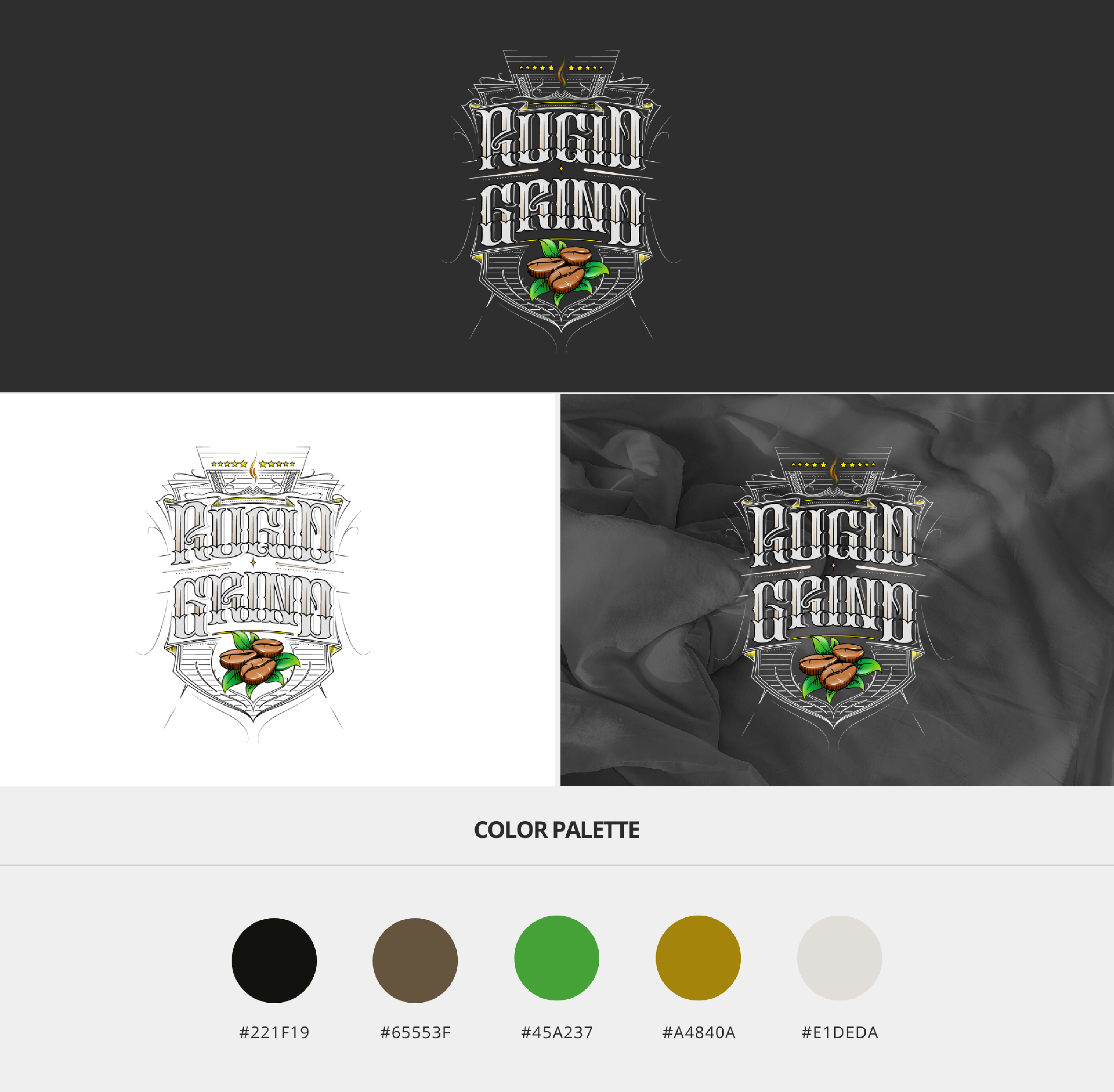
The Rugid Grind logo is a strategic blend of symbolism and style, encapsulating the brand’s ethos through a harmonious mix of traditional and contemporary design elements. At its core, the logo employs script-style typography reminiscent of vintage tattoo lettering, evoking a sense of craftsmanship and attention to detail. The choice of a gothic script is deliberate, hinting at a heritage and resilience that aligns with the brand’s rugged character.
The color palette is carefully chosen to mirror the natural world that coffee comes from—with greens representing the lushness of nature and browns reflecting the earth and the roasted beans themselves. The shield motif at the center of the design is a nod to strength and protection, suggesting the brand’s commitment to defending its social cause against teenage homelessness.
Furthermore, the stars above the shield symbolize excellence and high standards, while the shopping cart icon embedded within the crest subtly emphasizes the company’s commercial aspect. The logo’s layered complexity and detailed line work contribute to a rich visual identity that communicates Rugid Grind’s dedication to quality, sustainability, and social responsibility.

WEB DEVELOPMENT
The design theory for the Rugid Grind website revolves around a clean, modern aesthetic that supports the brand’s mission of social responsibility. The navigation is intuitive, with a focus on ease of use to ensure a smooth customer journey from homepage to checkout. Warmth is conveyed through the use of earthy tones in the color palette, drawing inspiration from the brand’s tattoo-style logo, and subtly reinforcing the organic, natural qualities of their coffee beans.
In line with their mission, the website utilizes a storytelling approach, especially in the “Why Rugid Grind?” section, which ties their product—specialty coffee—to their cause of reducing teenage homelessness. This narrative is visually complemented by images that are both inviting and indicative of community and shared experiences.
Typography is a mix of script for brand identity and clean sans-serif for readability, enhancing the site’s accessibility while also nodding to the artistry of the logo’s script style. Calls to action, like “Sip With A Purpose” and incentives like “Receive 5% Off Your Coffee Order,” are prominently featured to encourage engagement and conversion.
Overall, the website’s design is purpose-driven, seeking to create a seamless, engaging user experience that aligns with the brand’s ethical values and high-quality coffee offerings.

